Software used: Photoshop CS3
Hardware: Wacom Intuous3, iMac
No pencil sketch used, completely digital work.
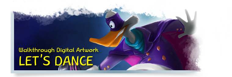
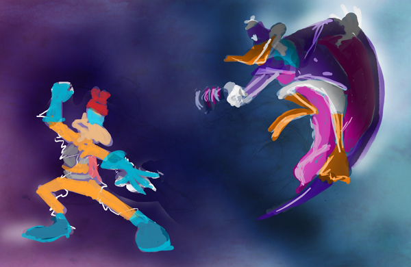
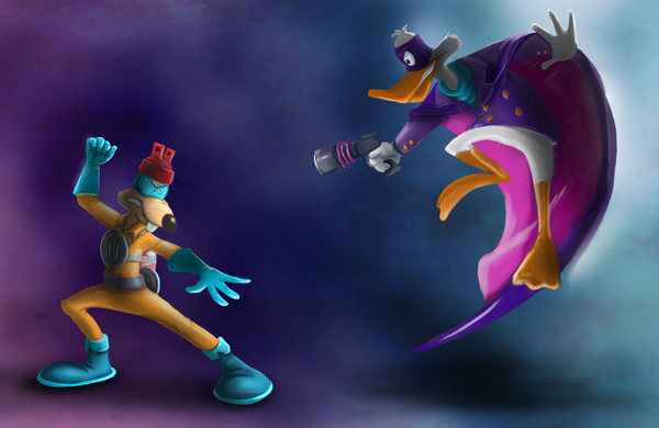
Started with a rough idea of what I wanted this to look like. Firstly, I wanted to experiment with motion lines and colour composition, as well as dark/light contrast. Topic of choice for this experiment was a nice, little fanart with cartoony characters so I wouldn’t have to worry too much about anatomy and other tedious stuff but could solely focus on flowing lines. These two guys, I can draw by heart with my eyes closed if necessary. Also, there’s some nice colour contrast in the clashing of yellow/orange and violet/blue.
Stage 1: Sketching
1. A simple rectangular background, medium grey. On a new layer, I drew the rough motion lines.
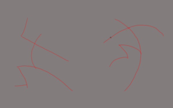
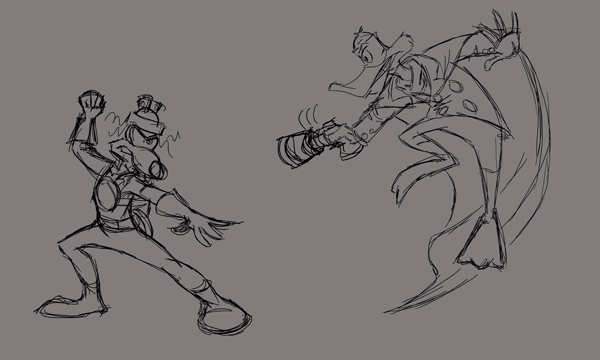
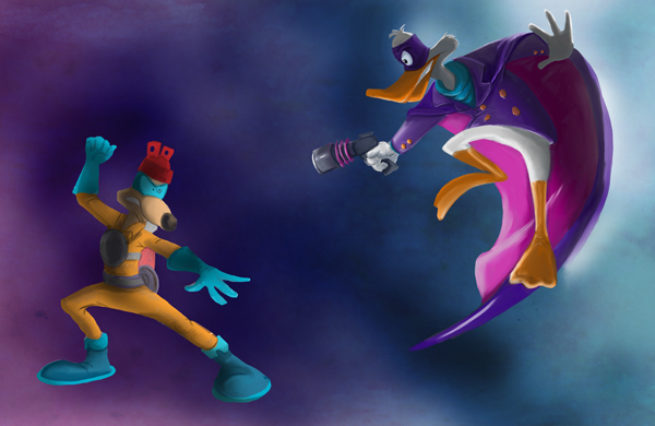
2. Some refining is taking place because fighting stick figures aren’t that exciting in the long run. New lines done on a new layer.

3. More refining. Motion lines and rough lineart set to invisible. WTF, Sparky’s legs look so messed up. o.O
Stage 2: Light and Shadow Composition
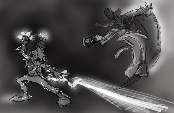
4. Initial lighting. First, I did the background and decided where I wanted the main light source to be. Namely, behind the jumping Darkwing. This way, I could use the back light for a nice dramatic effect. The secondary light source would be Sparky. As a rule of thumb, it often makes an object look more real or solid if one half is light against a dark background and the other half is dark against a light background. It makes the object blend right into the surrounding.
Stage 3: Flat Colours
5. Flat colours on a separate layer. No shading on this layer yet.

Stage 4: Shading and Blending, part 1
6. Used the greyscale lighting layer I did of the guys and switched its blending mode to “luminosity”. Fast and easy way to get the first shading done without hassle. Make sure you have your light and dark values fixed first, though. Made a simple colour gradient layer for the background and twisted the blending modes until it suited my needs. Note that I deliberately used violet on Megavolt’s half because it contrasts nicely with his yellowish outfit and makes him stand out more.
7. Eraser tool was my best friend while I got rid of all the messy blotches from the flat colours. Let the shading and blending begin. Started with Darkwing’s head because back lighting – it’s awesome. Instant drama. With a standard round brush tip, I smoothed out the uneven colouring. A setting of 30% opacity and 50% flow worked fine. Afterwards, heavily abused the smudge tool for blending. If you use a spattered-looking brush tip, it gives your lines a painterly qualitiy.
8. Details and blending on Darkwing’s half in large amounts. Surprisingly, all done on one layer (not counting the background layer). Erase, brush, smudge, repeat for an hour or so.
9. Set the special effects layer to invisible so I could continue to erase, brush, smudge on Sparky’s half. He doesn’t have any prominent shading yet – first wanted to be sure where I wanted the main brzzzling and sprzzzzling to take place.

Stage 5: Blending and Shading, part 2
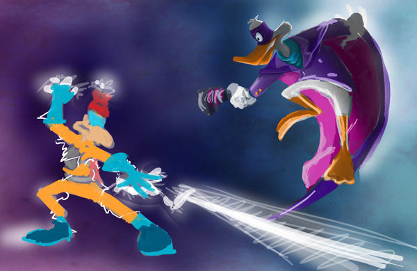
10. Yay, shading! Used the same method as before: Greyscale layer with shading set to “luminosity”. Combine layers when finished -tada.
11. Refining and blending. Added light and more shading. More intense light at Sparky’s hands. Deliberately used the light so his hands stand out against the dark, desaturated background.
Stage 6: Special Effects
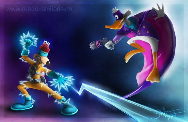
12. Mwahahaha – was looking forward to this for a while. Special effects, glooooowy, shiny things… The fun part! With very loose, short lines, I sketched the lightning bolts, using white in reduced, varying opacity.

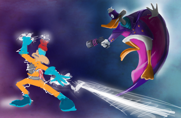
13. Added more lines on a separate layer set to “Overlay”. For this effect I used a bright blue. Softened the edges by brushing with a round soft brush tip, opacity set to 30%. Most important, don’t make your glow effects too smooth. Make it look uneven and organic for a more “alive” look. Added a simple frame and DONE! Fanart accomplished.
Animated Walkthrough
For the fun of it, I made a small video of the progress. In the first few images, it’ll become apparent that I messed about with the composition and kept moving the guys around. Layers, what would I do without them.
Hope this walkthrough could shed some light on basic themes like composition and colour theory as well as layer modes. Have fun trying stuff out in Photoshop or your software of choice!