The finished piece can be found here.
The first step is, of course, the idea. While hubby was watching the Olympic Games on TV I caught a glimpse of a wonderful lighting situation with bright snow contrasting against dark trees in the background. A skier was speeding down a hill, creating a high fountain of glittery, sparkly snow. It looked really good and I thought “what creature would fit into such a scene?”. I didn’t want to draw a skier and came up with a husky instead.
The next step is searching for reference. Even if you can draw by heart it often helps to have a reference picture for making sure you don’t forget an important detail.
Searching on deviantArt for reference pictures I found this:
http://majchy.deviantart.com/art/Husky-jump-44435664
Make sure to check out her gallery too, she’s got beautiful photos.
1. Creating a new PS document. This is 30 to 30 cm in size with 300 dpi, the colour mode is RGB. (For pros: You only need CMYK for professional printing. Most flashy filters don’t work in CMYK). Background is transparent.
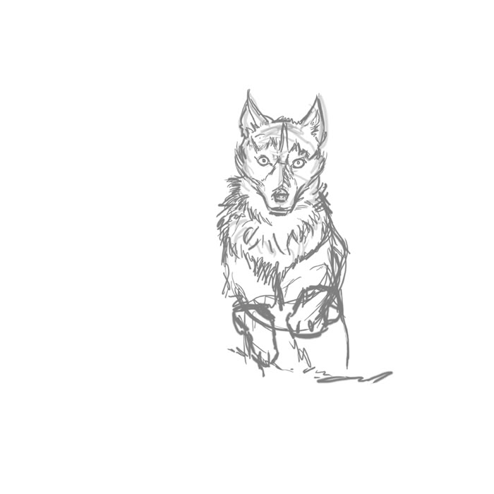
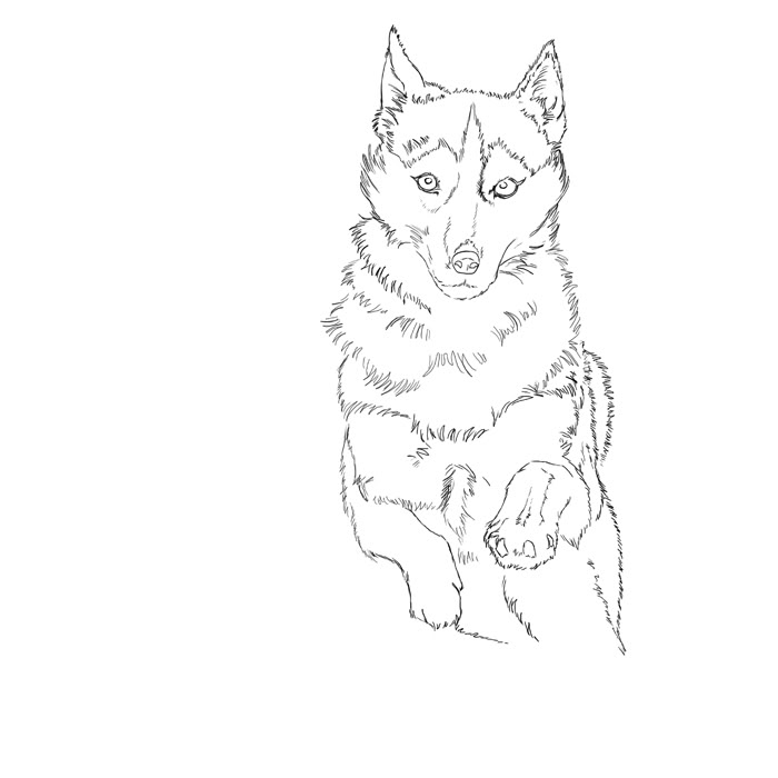
Using the reference picture I scribbled the figure of the husky with a 100% black hard edge brush. (the layer was set to 50% opacity afterwards)
2. Chosing a thin, hard edge brush I drew the lineart in a new layer above the sketch layer. That’s why it’s reduced in opacity, so it doesn’t get too confusing to see what what’s on the layer below). This is a bit time consuming but the more effort you use on this the better in the coming stages. After finishing the lineart I adjusted the scale and the placement in the document to fit the composition.
3. The next steps are basic dropping in of a schematic background and filling in the colour for the husky’s body.
The background is separated in two layers:
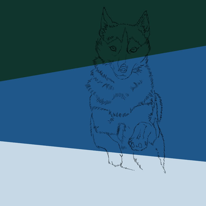
Layer 1 is the dark green, layer 2 is the “snow” aka the light and dark blue. This is the first step to define where the darker parts of the finished pic will be.
The husky consists now of two layers: layer 1 is the body colour and layer 2 is the lineart.
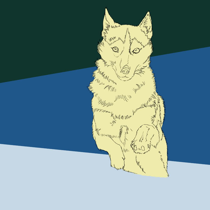
It’s never too early to think about light sources so let’s set where they should be in this picture.
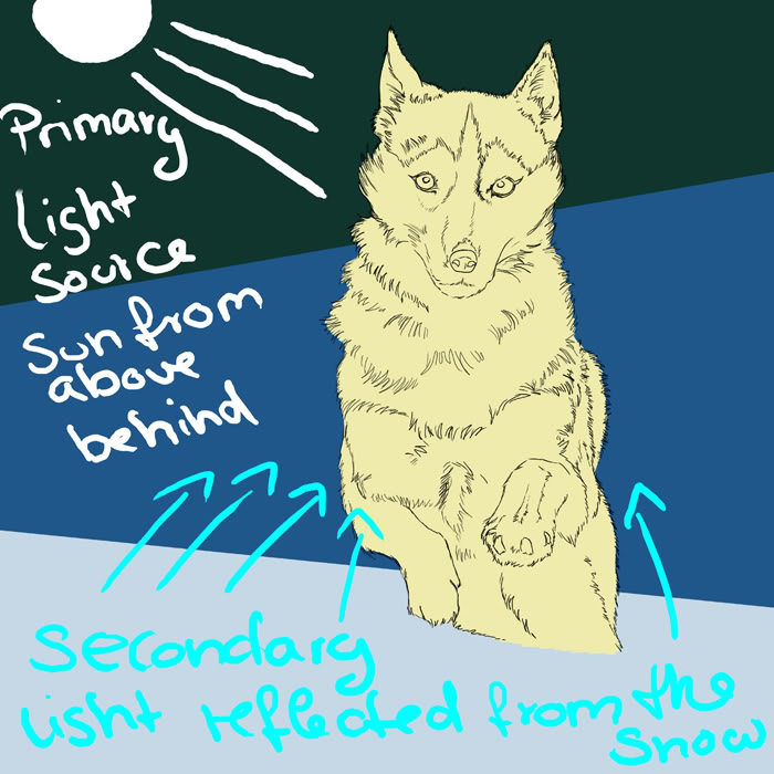
Always keep in mind when shading that light is practically everywhere. It’s not only the first obvious light source you see in a picture. Light is reflected by every surface and the light takes on the colour of the surface it’s reflected by.
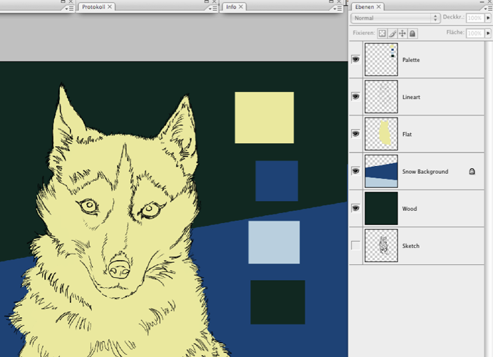
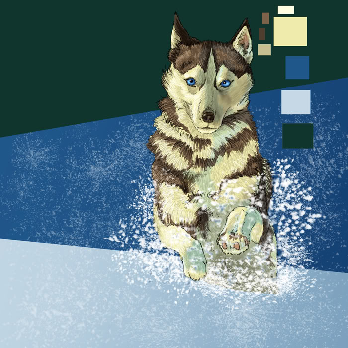
Something to make life easier for keeping consistency of colour throughout the process: create a layer for all the important base colours you use then you can use the eyedropper tool and pick up a colour anytime. You layers could look like this now:
After all the tedious preparations, let’s begin with the fun part! Let’s start to give the doggie a bit of fur.
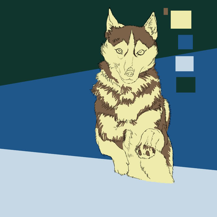
The first hesitant attempt at bringing structure to the fur:
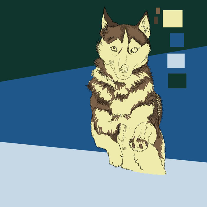
When starting to colour and shade avoid using black and white at all cost. Very few things in the visual world are truly black or truly white. Use those extremes very carefully and precisely, only for highlights and for empathising certain areas of your picture like the eyes of a person/animal/creature.
Even the snow in this picture isn’t white yet but in it’s natural shadow colour blue. The lineart is still black though but it will either disappear completely or will be blended partially into the picture, whatever looks best.
Create a new layer labelled “details” for the eyes and the nose as well as the paws. It’s not necessary to have them on a separate layer but I always find it helps to have specific details on a new layer to have more control while working on them as they’re usually the eyecatchers of a picture.

The next steps deal mainly with the first initial shading and creating the fur texture. Done with a thin, soft edge brush, 100% opacity with a dark variation of the base tone.
The lighter fur
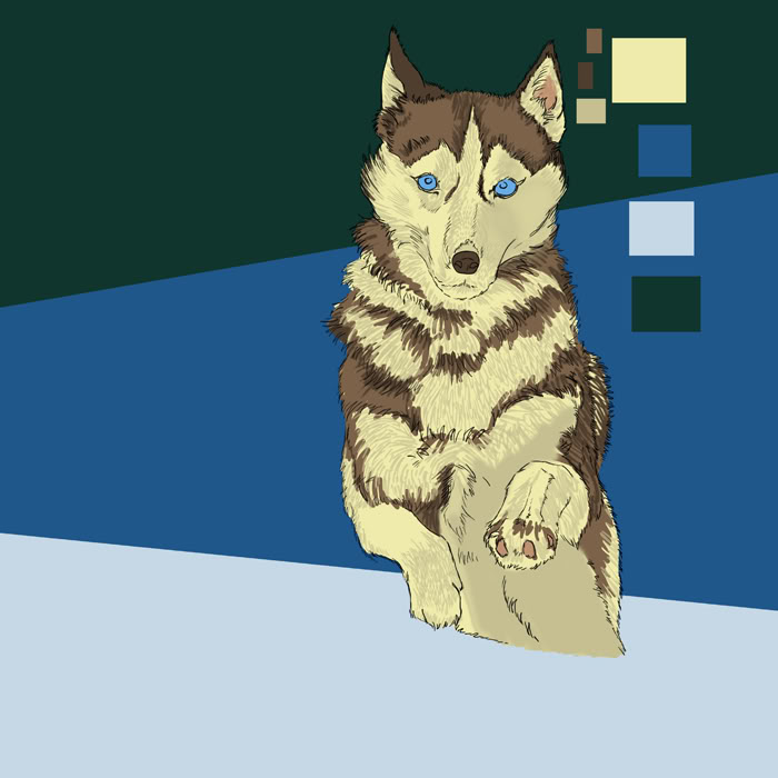
The darker fur

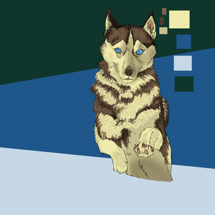
Now for the shading: create a new layer set to “multiply” and chose the light and dark brown tones to shade the lighter and darker parts of the husky’s body. (It helps to set it as a layer mask for the “flat” layer below because then you don’t have to mind the edges all the time, the colouring will be restricted to the husky; if you’re feeling uncomfortable with layer masks you can leave the layer as it is and use the lasso for masking instead) Use a soft edge brush and play around with the opacity settings, keep in mind that the shadows are darker on the right side of the painting because the sunlight comes from the upper left. Don’t shade the right side too dark though beacuse the snow reflects some of the light back onto the husky.
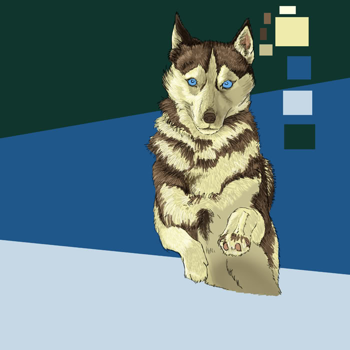
Create a new layer set to “Screen” (I set mine to 40% percent opacity after trying out different percentages) and use the light and dark brown base tones now to light up the fur parts hit by direct sunlight.
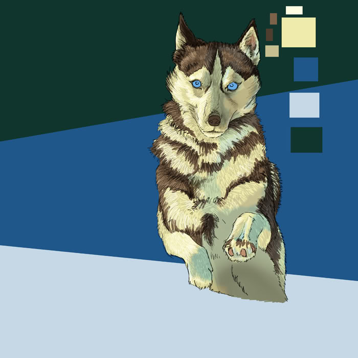
Create the next layer and set it to “Hard Light”. On this layer we will paint the blueish shades reflected by the snow. On the husky’s white fur the shades of the cold, blueish snow will always seem blue.
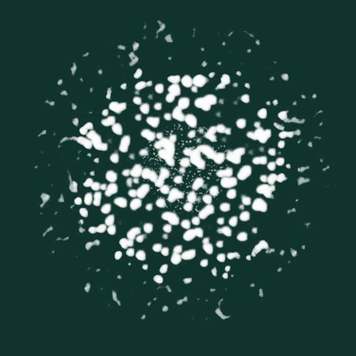
The husky still looks as if it’s sticking awkwardly in the ground so let’s give it some dynamics. Choose a spluttery brush tip from your brush palette. (You can also draw the snowflakes by hand but using a suitable brush tip is much faster and usually creates more random and natural looking textures)
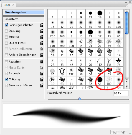
This is how the brush tip looks enlarged
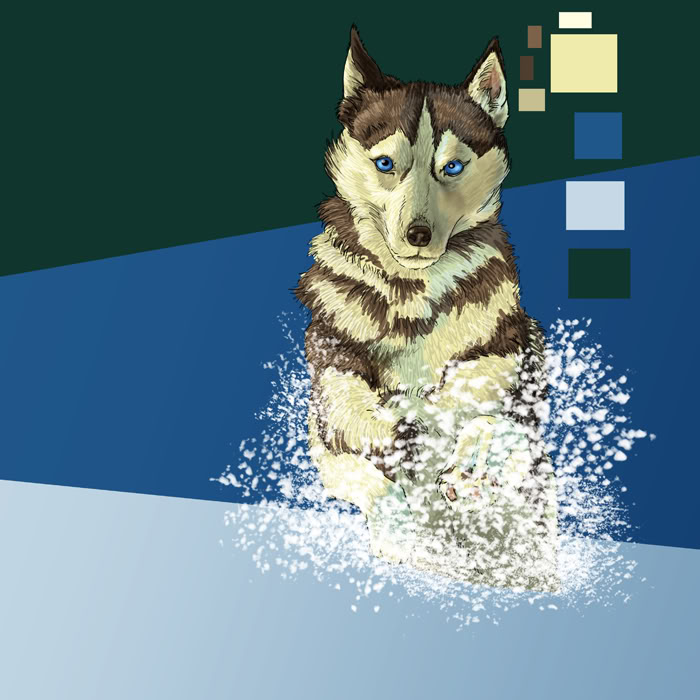
Create a new layer (yes, another one ;)) above the layers you have until now. Start painting the snowflakes in in a random manner, concentrating around the husky’s legs and feathering out at the rims. Use different brush sizes.
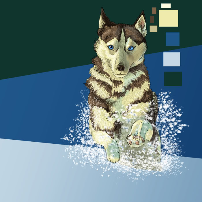
Use the eraser tool to delete all snowflakes you don’t need
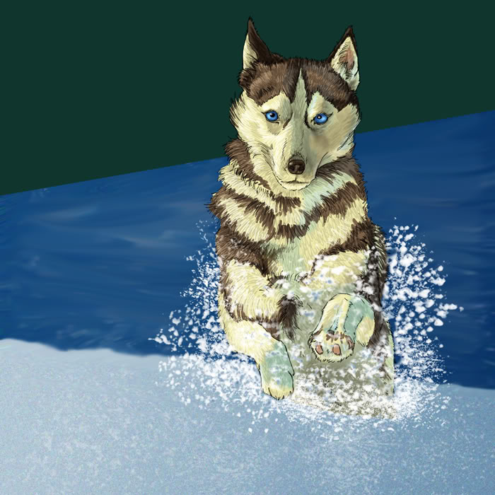
Let’s start on the background: Use the same brush tip you used for the snowflakes and dapple the snow layer with light blue
Use the Smudge tool and the Blur tool on the darker background.
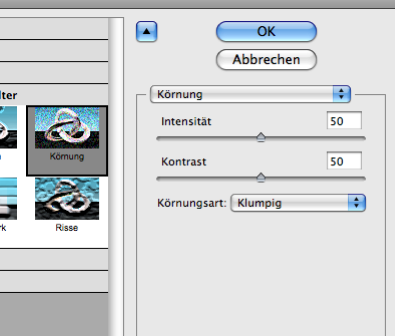
I also used a filter on the snow layer: the “Grain” filter (found in the “Texture” menu) I don’t have the exact translation for the setting I used, in the German version it’s called “clumpy”, it should be called something similar in the English version. You may have to try out what pixel setting work best.
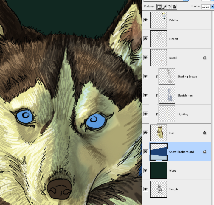
Something I use all the time, the layer lock. It prevents you from drawing onto areas of your layer you don’t want to draw on. Just click on the small “transparancy” symbol in your layer palette and the layer will be displayed with a “lock” symbol, this means that you can only work with the areas of the layer that already contain coloured pixels.
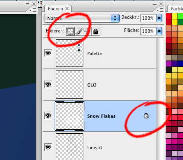
A close-up screenshot of the husky’s head with the layer palette:
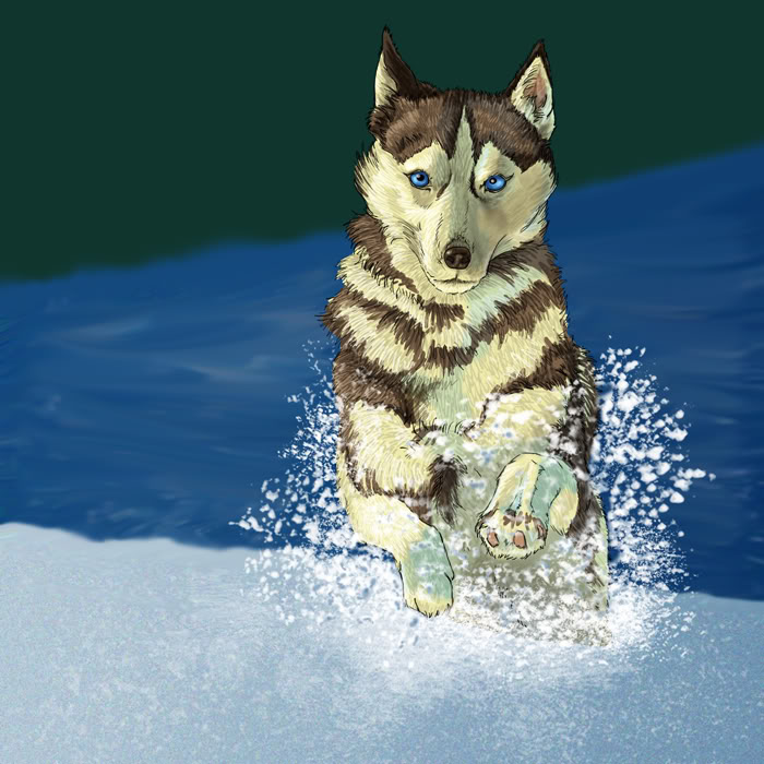
Used a soft brush with dark blue to blend the snow into the wood.
On a new layer above the wood layer set to mutiply I started on the trees, using another structured brush tip similar to the one for the snowflakes but a bit more rough. (You don’t have to do this on a new layer, you can paint directly onto the wood layer)
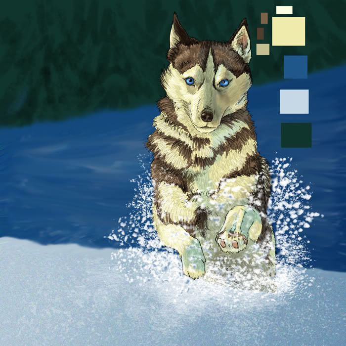
Added dark blue and light green to give the trees more depths and dimensions.

Use the Gaussian Blur filter for the wood layer to make it receed and not stand out too much. Blurring the background often creates more depth

One of my favourite layers: the Glow layer. Create a new layer and set it to “Lighten”, then pick a light colour (in our case light brown) and set the edges hit by the light aglow with a soft brush. You will have to experiment with opacity settings and brush size.
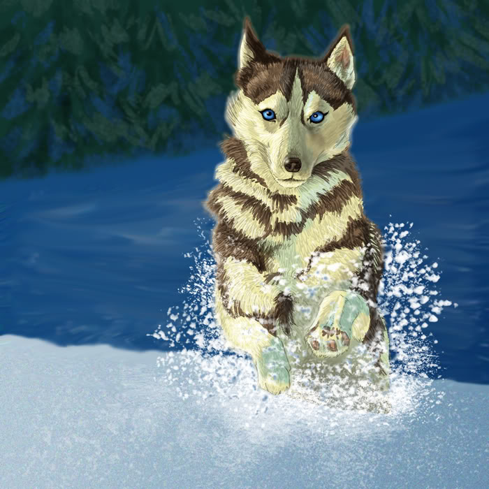
Deactivated the “Glow” layer for this. (I just forgot to switch it on, no other reason :o) Make a copy of the whole picture and reduce all layers to one. (You can do this either by saving the picture with a new name – so you don’t ruin the old one OR you can collect all your layers in a layer group, it’s the small “folder” icon at the bottom of your layer palette: create a new folder and drag and drop all layers into that folder, then you can duplicate that group and reduce only this group to one layer, this leaves your original layers intact) After you have reduced the copy to one layer put that new layer on top of all others and use the Gaussian Blur filter to make it softer, set the layer to “Soft Light”. This will make your picture look very weird at first but don’t be afraid, that’s right. Use the “Hue/Saturation” settings from the menu “Image” -> “Adjust” and play around with the settings until it brightens up to your liking. This whole process will add softness and more unity of colouring to the picture.
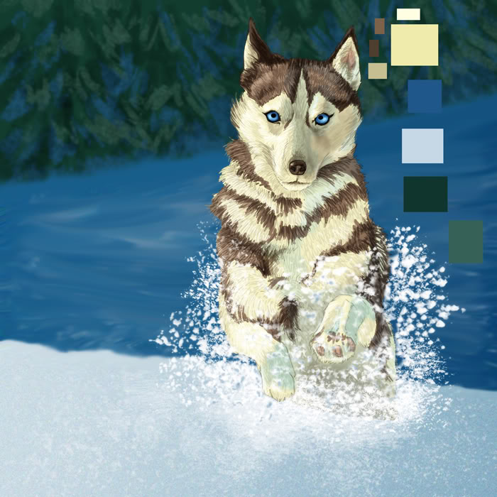
You know the drill by now: create – what? Now all together: A NEW LAYER. Set it to multiply and fill it with blue, not too dark. Your picture should now look similar to this:
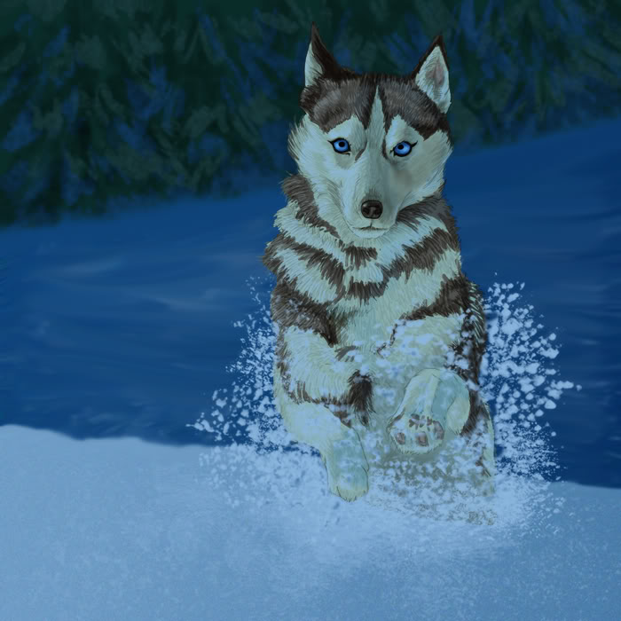
Now you can use the eraser tool to get rid of all the blue parts you don’t need, this layer is for shading.
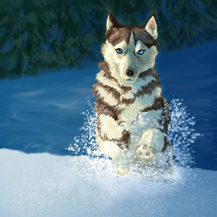
The next new layer (yes, another one) is set to “Colour Dodge”, on this layer you enhance the glow effect and add more speckles with the “Snowflake brush”, using a light blue. After that blur the layer with the Gaussian Blur. I also used curves to adjust the colouring of the husky’s fur because I thought it didn’t fit into the overall colour scheme anymore.
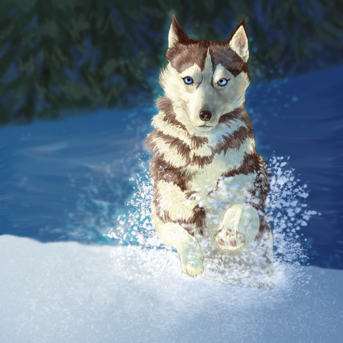
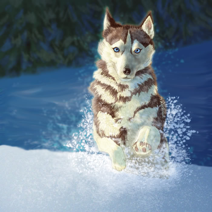
Almost done, but still not finished, we need a bit of framing to concentrate the view on the dog. You can create your own frame (on a separate layer :D) or, to make it look more organic you can search deviantart for texture stock, for example this:
http://princess-of-shadows.deviantart.com/art/vintage-grunge-textures-79040200
I used one of her textures on a layer set to “Soft Light” with an opacity of 70% and erased all parts around the husky because it looked to scratchy.
The finished piece:
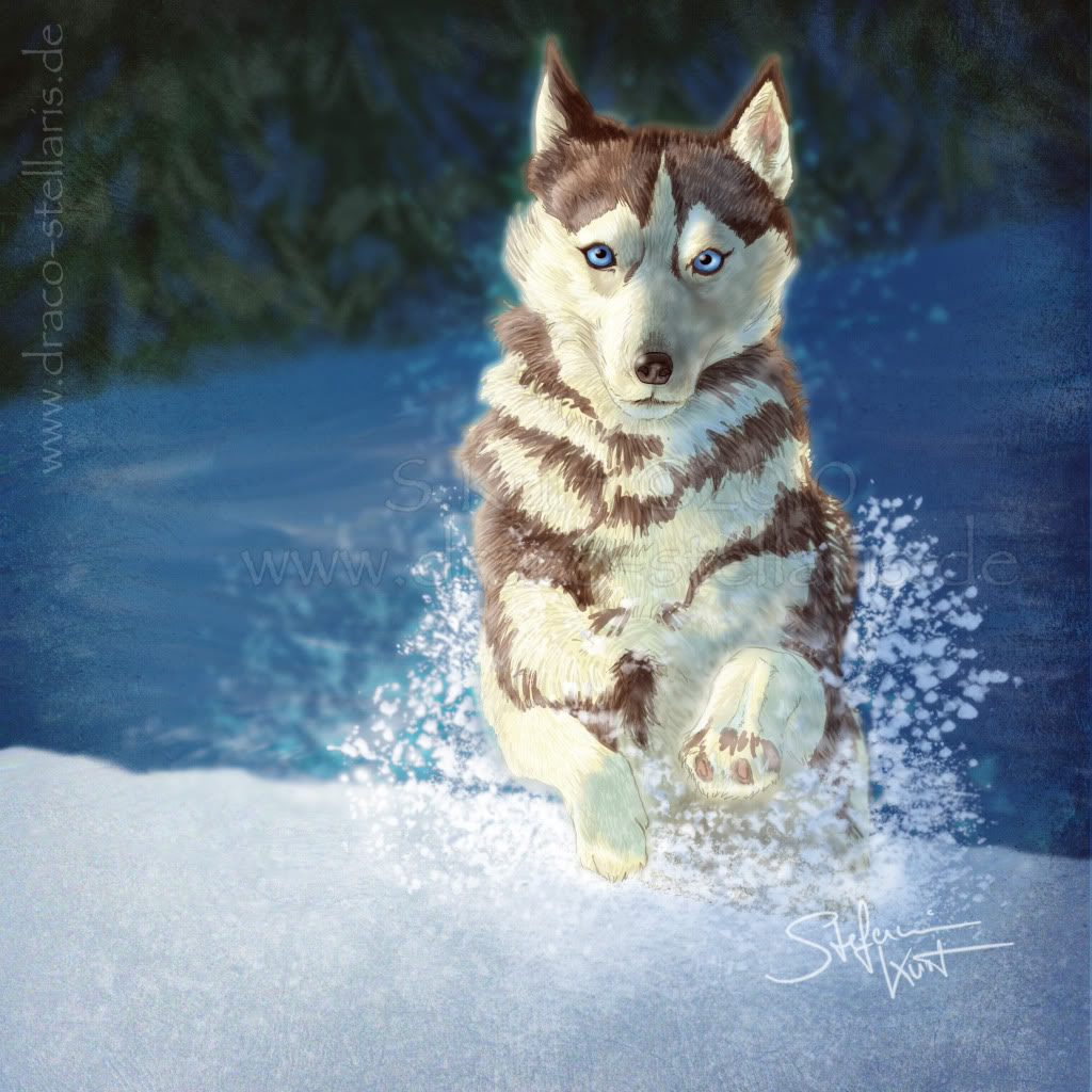
As you might have noticed I used a gazillion of layers, this is confusing for a beginner and not always necessary, I just do it because it allows for a maximum of control, you can always go back and alter a layer without having to repaint large areas of your picture. Photoshop offers a huge variety of solutions for one and the same problem and this tutorial isn’t THE ONE WAY to do things, every artist finds their own way of doing things, using their own method. The key to master PS is: keep practising, look how other artists do it and try things out to suit your own style and again – keep practising. PS takes as long to master as any traditional media, don’t loose patience, it’ll pay off over time. 🙂
And because it’s cool to see the walkthrough all in one go, have a video:

Leave a Reply